
This past week, I learned a new word: skeuomorphism.
A skeuomorph is an object or feature that imitates the design of a similar object made of a different material.

The skeuomorphic Town & Country station wagon.
Faux-leather and simulated woodgrain finishes are skeuomorphs. A classic example is the Chrysler Town & Country station wagon where the side panels appear to be wood but are really metal.
Skeuomorphs have been used extensively in the digital world. Think about how computer apps have been designed to look like their physical counterparts. MP3 players were first designed to look like stereo components. eBook readers mimicked the printed page, and note-taking programs resembled yellow legal pads or Post-its.
Apple’s Steve Jobs was a big fan of skeuomorphs, and he obsessed over getting just the right look and feel to Apple’s designs—calendars with leather stitching, bookshelves with wood veneers, clothbound address books, “docks” with reflective glass borders and windows with brushed-chrome edges.
But last week, with the release of Apple’s new mobile operating system, skeuomorphism was declared dead. Thanks to head Apple designer Jony Ive, iOS 7 is less ornamental, less “fake” than iOS 6. Gone is the heavy embellishment. Instead, we are greeted with a cleaner, brighter, flatter design said to be more focused on function than looks.
As I read the reviews and gathered courage to download iOS 7 for myself, I had mixed feelings about the new design. Now that I’ve used it for nearly a week, I still have mixed feelings.
Skeuomophs have a design purpose beyond ornamentation. They give the user cues, something that was needed in the early days of computers and mobile technology. But now designers tell us that’s no longer necessary, so we don’t need to get bogged down over whether a virtual news stand actually looks like a real news stand. Out with pseudo-physicality, in with digital authenticity.
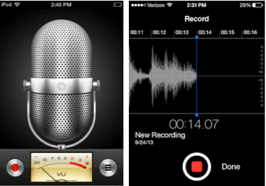
Skeuomorphic Voice Memo on the left vs.new iOS 7 version on the right.
Still, I do miss some of those familiar visual cues that gave Apple’s apps a warmer feel. For example, I use the Voice Memo app to record interviews. The old app had a stylized radio microphone, so you could imagine yourself being “on air” when you pushed the record button. It also had an old-fashioned VU meter. The new version replaces the mic and VU meter with a high-tech sound-wave generator. Now I feel like I’m conducting a science experiment rather than an interview.
Ditto for the Notes app, which used to give you a yellow, ruled sheet to write on. Now, it’s just a stark, white screen. That’s a little extreme, if you ask me.
Presumably app developers, who’ve complained about having to spend a lot of time polishing the look of an iPhone app, can now just design good, functional apps. I’m all for that. But I still think there’s room for some creativity, even an occasional nostalgic nod to the world we inhabit.
Perhaps Apple will loosen its design grip at some point and let us pick the “skins” we want for our iPhone apps, much the way Microsoft Media Player users can pick all kinds of cool looks for their virtual boom box. (Dream on, you say?)
Overall, though, I’m impressed with iOS 7. In particular, I like the re-imagined Safari web browser. Finally, Apple has made it easy to navigate between open web pages. You can view and shuffle through them like a stack of cards. I also like the “@” feature in bookmarks, where you can see all of the links in your Twitter feed. Now that is cool.
How ‘bout you? Have you downloaded iOS 7?


Hey Jay – Great Blog. I have been looking at iOS7 and need my grandson (6th grade) to help me download it and decipher what has changed and what is new. Thanks for the insight. I agree wholeheartedly with you!!
Steve Reynolds
Steve, thanks. Yes, your grandson will figure it out twice as fast as us old fogeys! – Jay
I downloaded last night and played with it for half an hour. So far, it’s slower, some apps don’t work and have to be reloaded, and I think it’s very austere in its graphic design (read, everything is white). I do like the sharper graphics though. But I better get it to work faster. More later.
Jeff, yikes, it’s supposed to launch apps faster! I agree with your comments on the look of the new iOS. A bit flat…and stark. – Jay
Pingback: Do Looks Really Matter? – bloomfield knoble